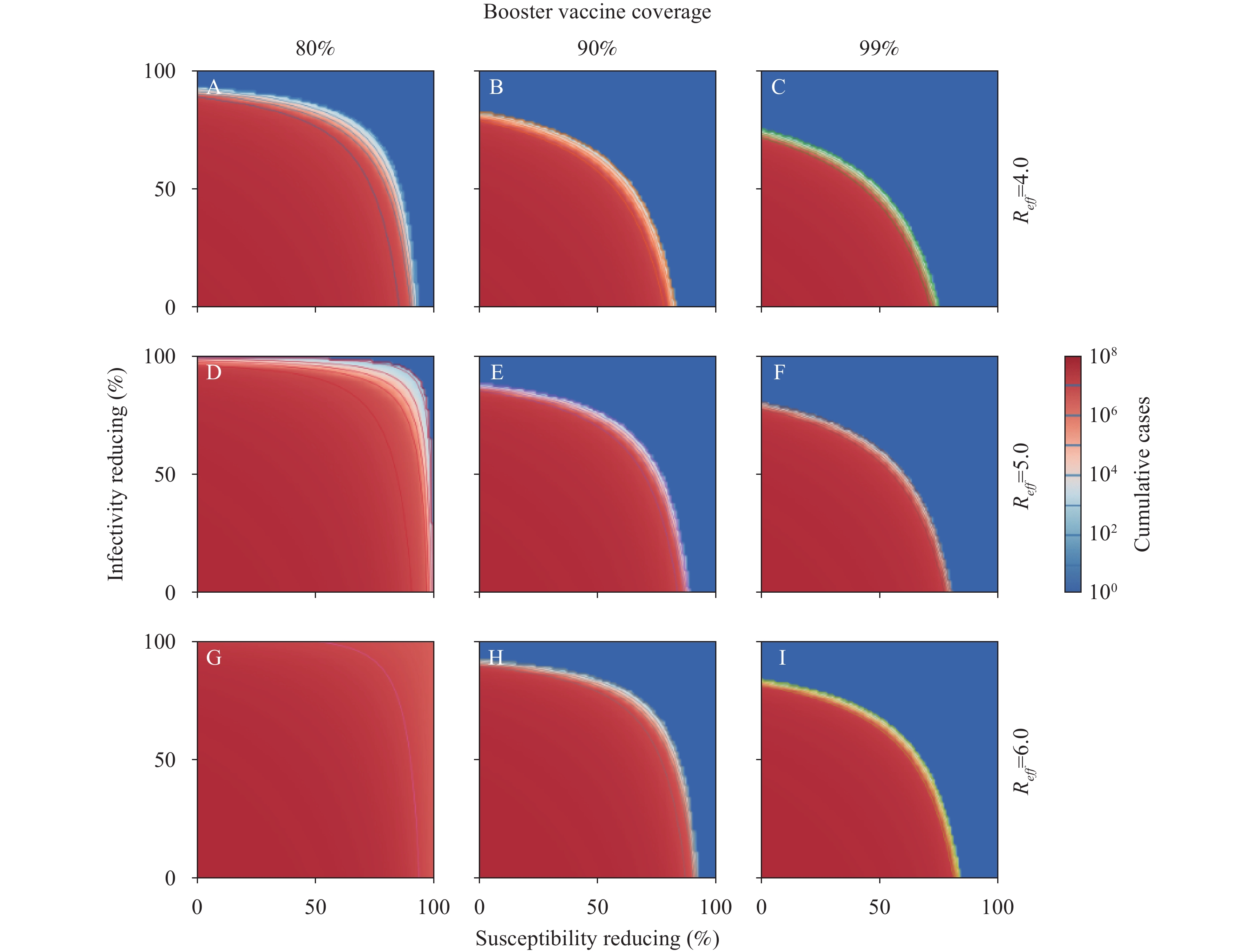
Learn More

Introduction
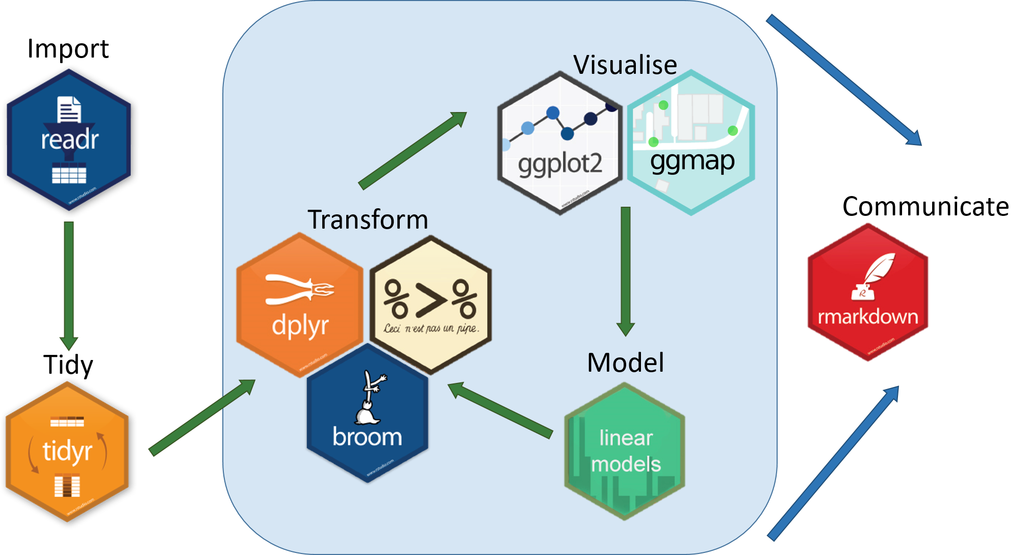
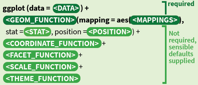
ggplot2 is a system for declaratively creating graphics, based on The Grammar of Graphics. You provide the data, tell ggplot2 how to map variables to aesthetics, what graphical primitives to use, and it takes care of the details.
ggplot2 是一个基于图形语法声明式创建图形的系统。您提供数据,告诉 ggplot2 如何将变量映射到美学,使用什么图形代码,它会处理细节。
ggplot2 是 tidyverse 的一部分,也就是说我们安装 tidyverse 的时候,ggplot2 也会被安装。
Installation
install.packages("tidyverse") # Install tidyverse
library(tidyverse) # Load tidyverse
Source: The Tidyverse · Teach Data Science. (2024, January 18). Retrieved from https://teachdatascience.com/tidyverse
What is a Plot?
🕵️♀ Question: 大家都知道哪些统计图形?
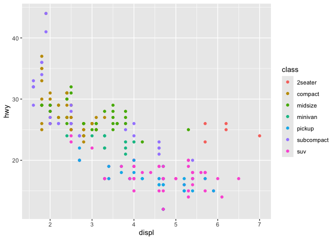
运行这个代码,你会发现,这个图形是由一系列的点组成的,这些点的位置是由 x 和 y 决定的,而点的颜色是由 class 决定的。
ggplot(data = mpg,

       mapping = aes(x = displ,
                     y = hwy,
                     colour = class)) +

  geom_point()
🕵️♀ Question: 这一个统计图由哪些元素构成的?
Source: Create Elegant Data Visualisations Using the Grammar of Graphics. (2023, December 18). Retrieved from https://ggplot2.tidyverse.org
The Grammar of Graphics
library(ggplot2)
ggplot(data = mpg,
    mapping = aes(x = displ,
                  y = hwy,
                  colour = class)) +
    geom_point()+
    coord_equal(ratio = 1/5)+
    facet_wrap(.~cyl,nrow = 1)+
    scale_color_viridis_d()+
    theme_bw()+
    theme(panel.grid.major = element_blank(),
          plot.title = element_text(size = 16),
          axis.line = element_line(size = 1),
          panel.background = element_rect(fill = 'transparent', colour = 'black'),
          plot.margin = margin(5,5, 5,5))+
    labs(title = 'A',
         colour = 'Class of car')
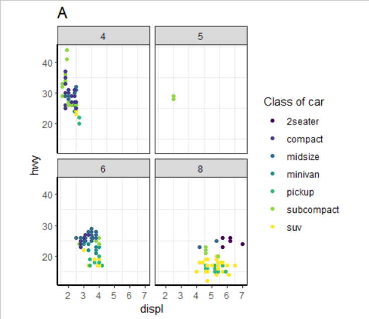
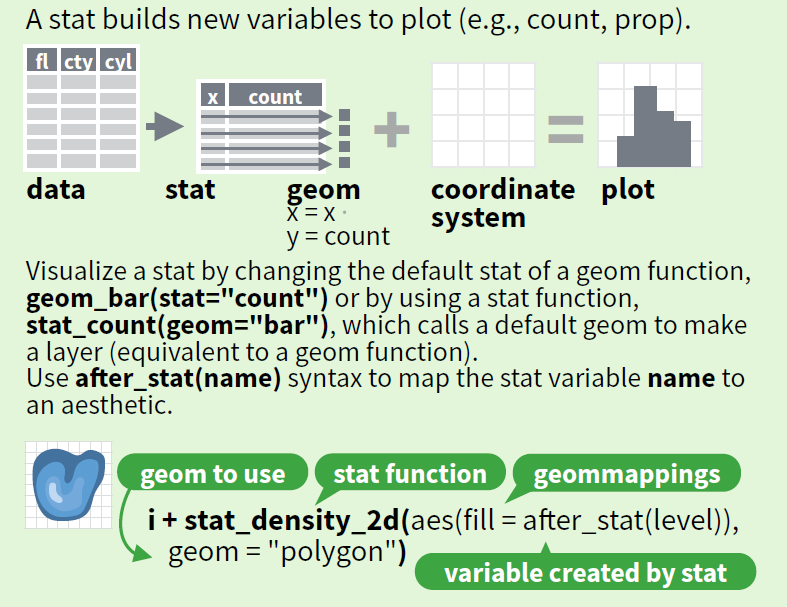
- theme(主题): theme_bw()
- Space(空间): coord_cartesian()
- Statistical models(统计变换): stat_smooth()
- Facets(分面): facet_wrap()
- Geometry(几何对象): geom_point()
- Aesthetics(美学映射): x, y, color
- Data(数据集): mpg
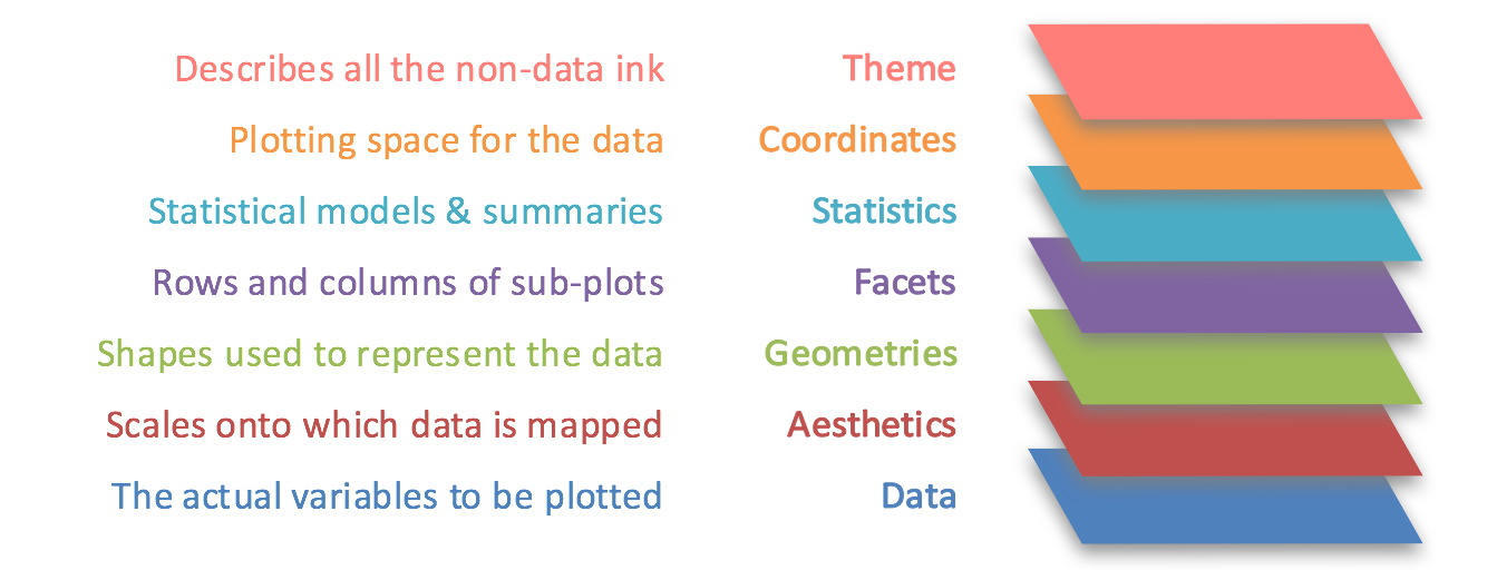
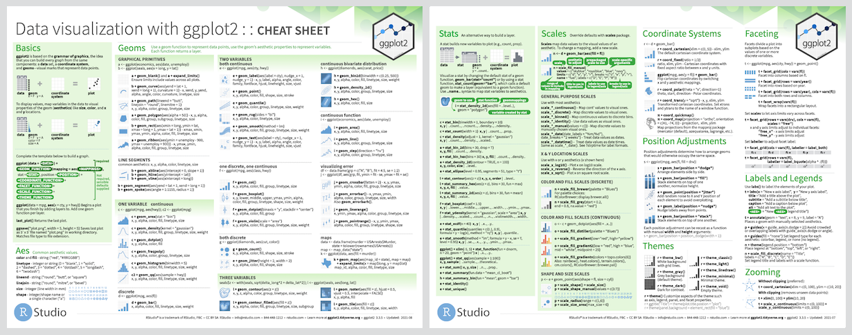
Source: Data Visualization Cheatsheet · RStudio. (2024, January 18). Retrieved from https://rstudio.com/resources/cheatsheets/
Data
数据是统计图形的核心,作图之前一定要先读懂数据。
长数据
| 个体 | 变量 | 值 |
|---|---|---|
| 1 | x | 1 |
| 1 | y | 2 |
| 2 | x | 3 |
| 2 | y | 4 |
宽数据
| 个体 | x | y |
|---|---|---|
| 1 | 1 | 2 |
| 2 | 3 | 4 |
🕵️♀ Question: 长数据还是宽数据?
一般选择长数据,因为长数据更容易处理。
Data transformation
数据的长宽转换
library(tidyverse)
data <- tibble(
  x = 1:4,
  y = 1:4,
  z = 1:4
)
data
      x     y     z
  <int> <int> <int>
1     1     1     1
2     2     2     2
3     3     3     3
4     4     4     4
data |>
    pivot_longer(cols = everything())
   name  value
   <chr> <int>
 1 x         1
 2 y         1
 3 z         1
 4 x         2
 5 y         2
 6 z         2
 7 x         3
data |>
    pivot_longer(cols = c(y, z),
                 names_to = 'name',
                 values_to = 'value')
       x name  value
   <int> <chr> <int>
 1     1 y         1
 2     1 z         1
 3     2 y         2
 4     2 z         2
 5     3 y         3
看起来很简单对吧?但是这个函数的参数有很多,你可以通过?pivot_longer查看。
Aesthetics
美学映射是指将数据集中的变量映射到图形的视觉属性上,比如颜色、形状、大小等。
- x
- y
- fill
- color
- shape
- linetype
- size
- alpha
- group
这些并不是固定的,你可以自己定义。
如果需要将变量映射到美学上,需要在aes()中定义。
对于支持的美学映射,可以通过?aes或者?geom_xxxx查看。
library(ggplot2)
ggplot(data = mpg) +
    geom_point(mapping = aes(x = displ,
                             y = hwy,
                             colour = class))+
    coord_equal(ratio = 1/5)+
    facet_wrap(.~cyl,nrow = 1)+
    scale_color_viridis_d()+
    theme_bw()+
    theme(panel.grid.major = element_blank(),
          plot.title = element_text(size = 16),
          axis.line = element_line(size = 1),
          panel.background = element_rect(fill = 'transparent', colour = 'black'),
          plot.margin = margin(5,5, 5,5))+
    labs(title = 'A',
         colour = 'Class of car')
🕵️♀ Question: 哪些变量被映射到了美学上?
displ, hwy, class
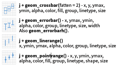
Geometry
几何对象是指图形的形状,比如点、线、面等。
也就是说我们需要通过geom_xxxx()来定义图形的形状,如散点图、折线图、柱状图等。
🕵️♀ Question: 回忆下一些统计学知识,你知道哪些图形?它们分别适用于什么变量?
如: 散点图:两个连续性/定量变量
我们通常将变量分为几类
- 定性变量,如性别、学历等。
- 有序定性变量,如学历。
- 无序定性变量,如性别。
- 定量变量,如年龄、身高等。
One variable
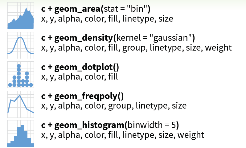

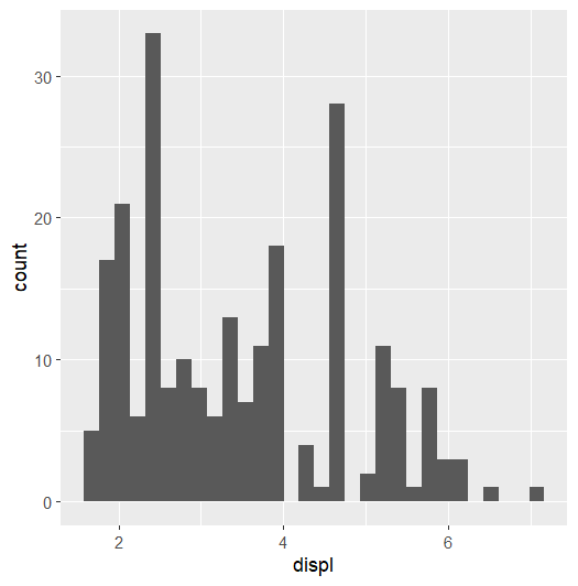
直方图
ggplot(data = mpg) +
    geom_histogram(mapping = aes(x = displ))

ggplot(data = mpg) +
    geom_freqpoly(mapping = aes(x = displ))

ggplot(data = mpg) +
    geom_density(mapping = aes(x = displ))
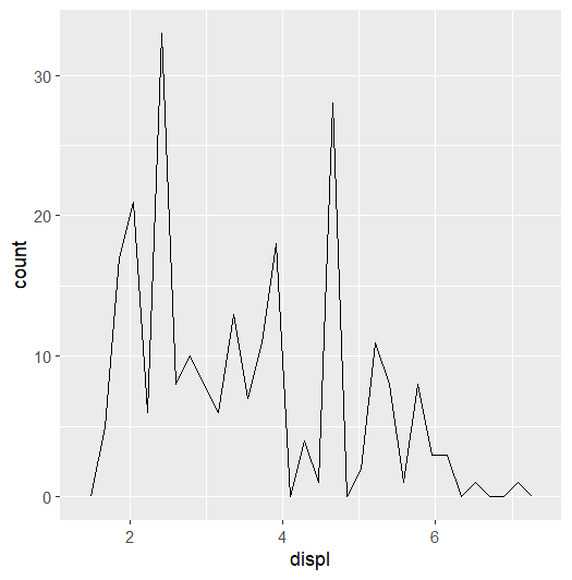
频率图
ggplot(data = mpg) +
    geom_histogram(mapping = aes(x = displ))

ggplot(data = mpg) +
    geom_freqpoly(mapping = aes(x = displ))

ggplot(data = mpg) +
    geom_density(mapping = aes(x = displ))
核密度图
ggplot(data = mpg) +
    geom_histogram(mapping = aes(x = displ))

ggplot(data = mpg) +
    geom_freqpoly(mapping = aes(x = displ))

ggplot(data = mpg) +
    geom_density(mapping = aes(x = displ))

Two variables
定量+定量
常用的只有 geom_point, geom_line, geom_smooth, geom_area
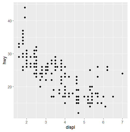
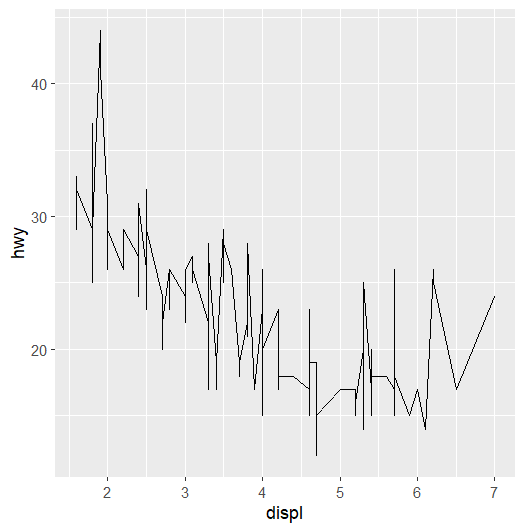
散点图
ggplot(data = mpg) +
    geom_point(mapping = aes(x = displ,
                             y = hwy))

ggplot(data = mpg) +
    geom_line(mapping = aes(x = displ,
                            y = hwy))

ggplot(data = mpg) +
    geom_smooth(mapping = aes(x = displ,
                              y = hwy))

ggplot(data = mpg) +
    geom_area(mapping = aes(x = displ,
                            y = hwy))
折线图
ggplot(data = mpg) +
    geom_point(mapping = aes(x = displ,
                             y = hwy))

ggplot(data = mpg) +
    geom_line(mapping = aes(x = displ,
                            y = hwy))

ggplot(data = mpg) +
    geom_smooth(mapping = aes(x = displ,
                              y = hwy))

ggplot(data = mpg) +
    geom_area(mapping = aes(x = displ,
                            y = hwy))
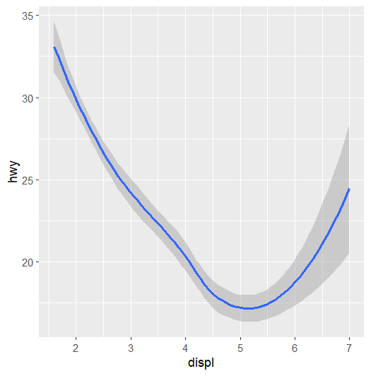
平滑曲线
ggplot(data = mpg) +
    geom_point(mapping = aes(x = displ,
                             y = hwy))

ggplot(data = mpg) +
    geom_line(mapping = aes(x = displ,
                            y = hwy))

ggplot(data = mpg) +
    geom_smooth(mapping = aes(x = displ,
                              y = hwy))

ggplot(data = mpg) +
    geom_area(mapping = aes(x = displ,
                            y = hwy))
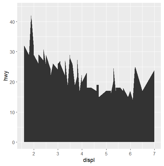
面积图
ggplot(data = mpg) +
    geom_point(mapping = aes(x = displ,
                             y = hwy))

ggplot(data = mpg) +
    geom_line(mapping = aes(x = displ,
                            y = hwy))

ggplot(data = mpg) +
    geom_smooth(mapping = aes(x = displ,
                              y = hwy))

ggplot(data = mpg) +
    geom_area(mapping = aes(x = displ,
                            y = hwy))
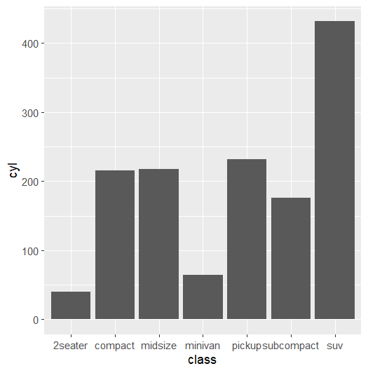
定量+定性
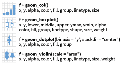
柱状图
ggplot(data = mpg) +
    geom_col(mapping = aes(x = class,
                           y = cyl))

ggplot(data = mpg) +
    geom_boxplot(mapping = aes(x = class,
                               y = hwy))

ggplot(data = mpg) +
    geom_dotplot(mapping = aes(x = class,
                               y = hwy))

ggplot(data = mpg) +
    geom_violin(mapping = aes(x = class,
                              y = hwy))
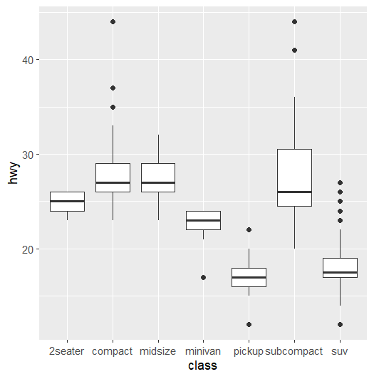
箱式图
ggplot(data = mpg) +
    geom_col(mapping = aes(x = class,
                           y = cyl))

ggplot(data = mpg) +
    geom_boxplot(mapping = aes(x = class,
                               y = hwy))

ggplot(data = mpg) +
    geom_dotplot(mapping = aes(x = class,
                               y = hwy))

ggplot(data = mpg) +
    geom_violin(mapping = aes(x = class,
                              y = hwy))
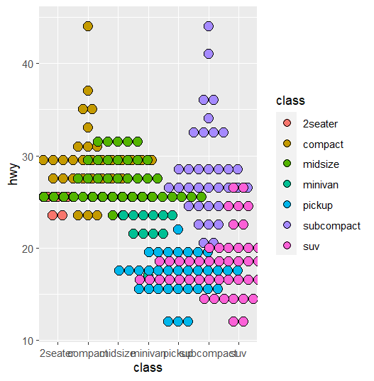
点图
ggplot(data = mpg) +
    geom_col(mapping = aes(x = class,
                           y = cyl))

ggplot(data = mpg) +
    geom_boxplot(mapping = aes(x = class,
                               y = hwy))

ggplot(data = mpg) +
    geom_dotplot(mapping = aes(x = class,
                               y = hwy,
                               fill = class),
                 binaxis = 'y',
                 stackdir = 'center')

ggplot(data = mpg) +
    geom_violin(mapping = aes(x = class,
                              y = hwy))
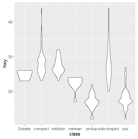
小提琴
ggplot(data = mpg) +
    geom_col(mapping = aes(x = class,
                           y = cyl))

ggplot(data = mpg) +
    geom_boxplot(mapping = aes(x = class,
                               y = hwy))

ggplot(data = mpg) +
    geom_dotplot(mapping = aes(x = class,
                               y = hwy,
                               fill = class),
                 binaxis = 'y',
                 stackdir = 'center')

ggplot(data = mpg) +
    geom_violin(mapping = aes(x = class,
                              y = hwy))
Two variables
常用使用 sf 提供的 geom_sf.
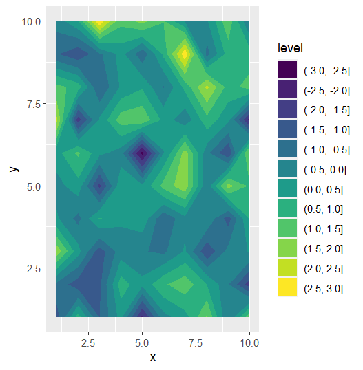
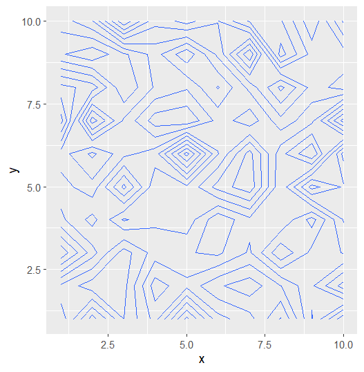
热图
相信你已经掌握了这些简单的图形,接下来我们来看看一些高级的用法。
热图类 Test data
data <- data.frame(
  x = rep(1:10, 10),
  y = rep(1:10, each = 10),
  z = rnorm(100)
)

ggplot(data = data) +
    geom_contour_filled(mapping = aes(x = x,
                                       y = y,
                                       z = z))

ggplot(data = data) +
    geom_contour(mapping = aes(x = x,
                               y = y,
                               z = z))

ggplot(data = data) +
    geom_tile(mapping = aes(x = x,
                            y = y,
                            fill = z))

ggplot(data = data) +
    geom_raster(mapping = aes(x = x,
                              y = y,
                              fill = z))
热图类
data <- data.frame(
  x = rep(1:10, 10),
  y = rep(1:10, each = 10),
  z = rnorm(100)
)

ggplot(data = data) +
    geom_contour_filled(mapping = aes(x = x,
                                       y = y,
                                       z = z))

ggplot(data = data) +
    geom_contour(mapping = aes(x = x,
                               y = y,
                               z = z))

ggplot(data = data) +
    geom_tile(mapping = aes(x = x,
                            y = y,
                            fill = z))

ggplot(data = data) +
    geom_raster(mapping = aes(x = x,
                              y = y,
                              fill = z))
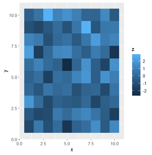 数据集很大使用geom_raster; 数据集较小geom_tile
 Three variables
- 定性+定性+定性
- 定性+定性+定量
- 定性+定量+定量
- 定量+定量+定量
除了热图这种比较常用的以外,3D 图标也会经常用到,但是 3D 图标的缺点是不够直观,而且不够美观。不建议大家使用,也就是说非必要不适用。
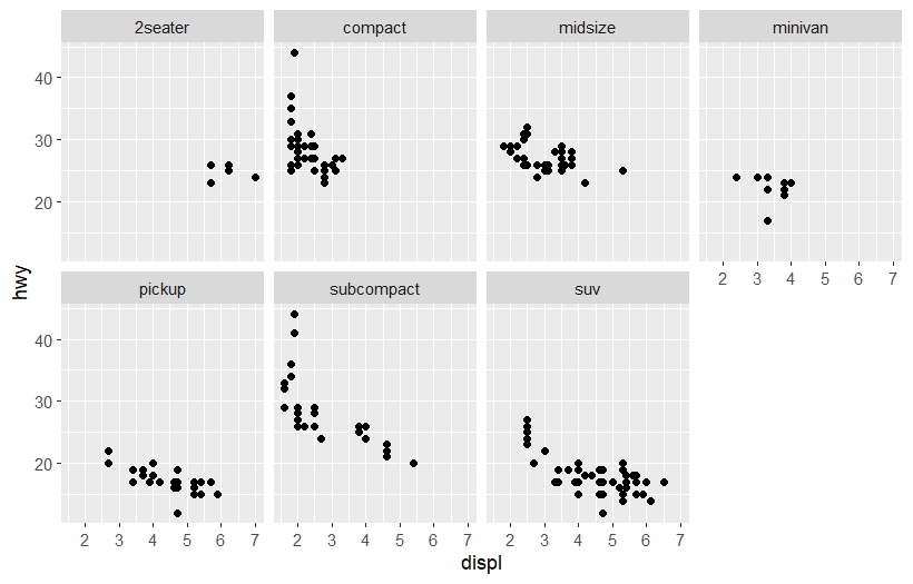
Facets
一个图拆分为多个子图,每个子图展示不同的数据。
Why facet?
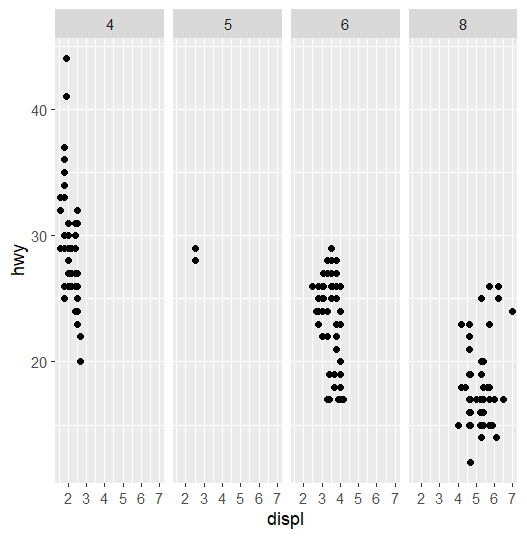
ggplot(data = mpg) +
  geom_point(mapping = aes(x = displ,
                           y = hwy))
ggplot(data = mpg) +
  geom_point(mapping = aes(x = displ,
                           y = hwy))+
  facet_wrap(.~class,nrow = 2)

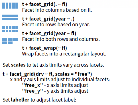
facet_grid
ggplot(data = mpg) +
  geom_point(mapping = aes(x = displ,
                           y = hwy))+
  facet_grid(.~cyl)
ggplot(data = mpg) +
  geom_point(mapping = aes(x = displ,
                           y = hwy))+
  facet_grid(cyl~.)
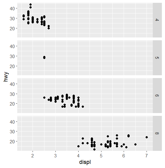
facet_grid
ggplot(data = mpg) +
  geom_point(mapping = aes(x = displ,
                           y = hwy))+
  facet_grid(cyl~.)
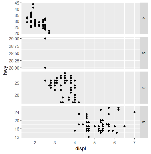
ggplot(data = mpg) +
  geom_point(mapping = aes(x = displ,
                           y = hwy))+
  facet_grid(cyl~.,
             scales = 'free')
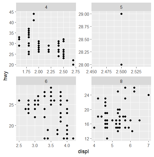
facet_wrap
ggplot(data = mpg) +
  geom_point(mapping = aes(x = displ,
                           y = hwy))+
  facet_grid(cyl~.,
             scales = 'free')
ggplot(data = mpg) +
  geom_point(mapping = aes(x = displ,
                           y = hwy))+
  facet_wrap(cyl~.,
             scales = 'free')
summary
如果需要任意堆积,可以使用facet_wrap()。如果要按照某个变量堆积,可以使用facet_grid()。
对于facet_wrap(),可以使用nrow和ncol来控制子图的行数和列数。
更多信息可以通过?facet_wrap和?facet_grid查看。
Three variables
- 定性+定性+定性
- 定性+定性+定量
- 定性+定量+定量
- 定量+定量+定量

Statistical models
我更倾向于先把数据处理好,再作图。
Space
Coordinate systems
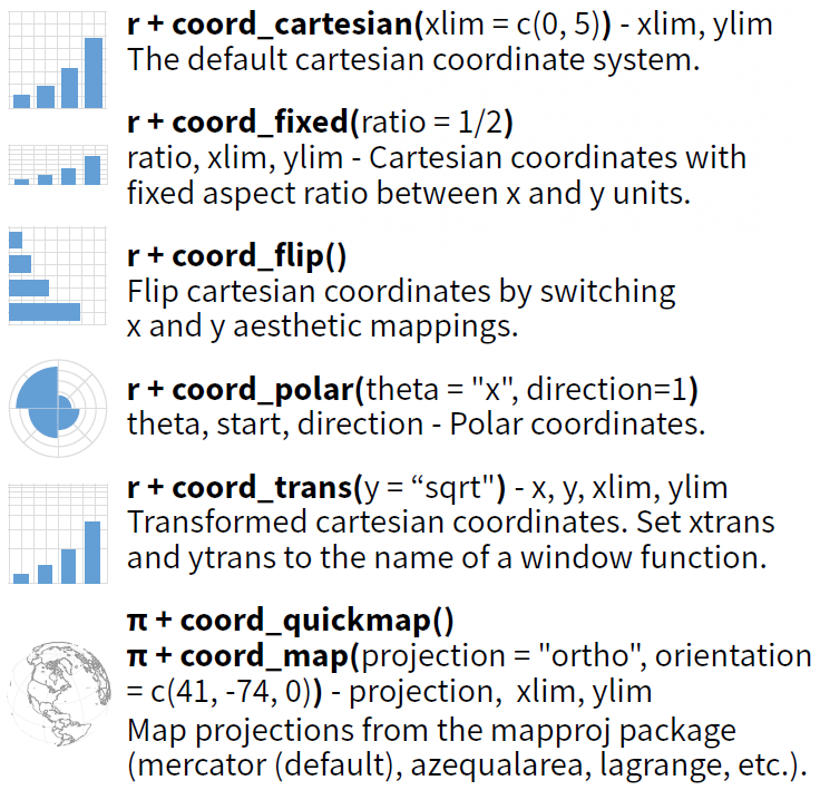
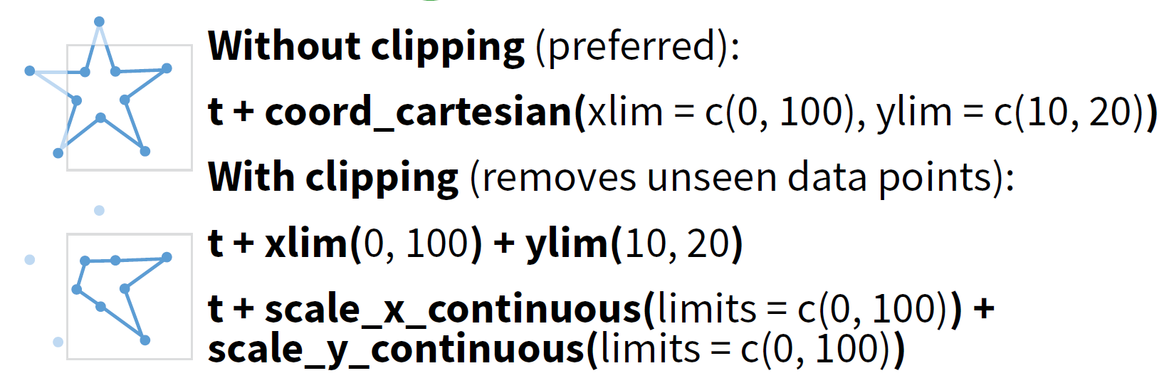
- coord_cartesian: 用于裁剪图片修正显示范围,常用于制作字母图。
- coord_flip: 用于翻转坐标轴。
- coord_fixed: 用于固定坐标轴比例,常用于绘制热图和地图。
- coord_polar 和 coord_quickmap:使用较少。
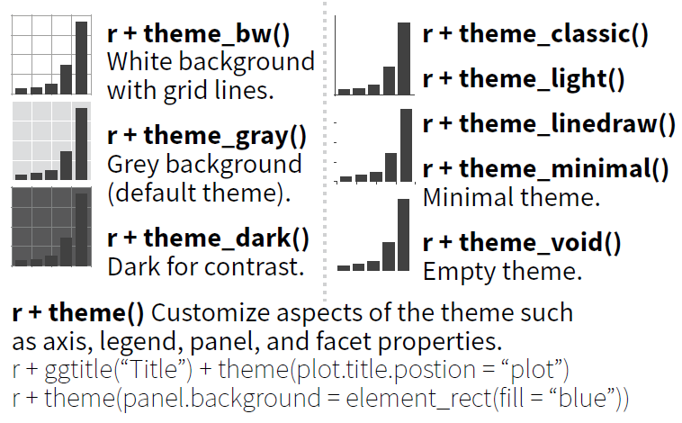
Theme
设置背景和坐标轴
library(ggplot2)
ggplot(data = mpg) +
    geom_point(mapping = aes(x = displ,
                             y = hwy,
                             colour = class))+
    coord_equal(ratio = 1/5)+
    facet_wrap(.~cyl,nrow = 1)+
    scale_color_viridis_d()+
    theme_bw()+
    theme(panel.grid.major = element_blank(),
          plot.title = element_text(size = 16),
          axis.line = element_line(size = 1),
          panel.background = element_rect(fill = 'transparent', colour = 'black'),
          plot.margin = margin(5,5, 5,5))+
    labs(title = 'A',
         colour = 'Class of car')
主题模板 + 主题自定义
🕵️♀ Question: 这两部分能否调转过来?
What else?
Scales
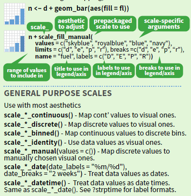
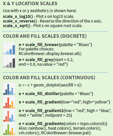
Scales of axis
根据变量类型设置坐标轴 (以 x 轴为例)
| Variable type | R class | Scale function |
|---|---|---|
| 定量变量 | numeric/integer | scale_x_continuous() |
| 定性变量 | factor/character | scale_x_discrete() |
| 日期/时间 | date/POSIXct | scale_x_date() |
ggplot(data = data) +
    geom_tile(mapping = aes(x = x,
                            y = y,
                            fill = z))+
    scale_x_continuous(expand = c(0,0))+
    scale_y_continuous(expand = c(0,0))
ggplot(data = data) +
    geom_tile(mapping = aes(x = x,
                            y = y,
                            fill = z))+
    scale_x_continuous(expand = c(0,0))+
    scale_y_continuous(expand = c(0,0))
Scales of guides
根据变量类型设置图例 (以 fill 轴为例)
| Variable type | R class | Scale function |
|---|---|---|
| 定量变量 | numeric/integer | scale_fill_distiller() |
| scale_fill_gradient() | ||
| scale_fill_gradient2() | ||
| scale_fill_gradientn() | ||
| 定性变量 | factor/character | scale_fill_brewer() |
| scale_fill_manual() |
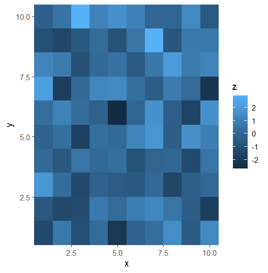
ggplot(data = data) +
    geom_tile(mapping = aes(x = x,
                            y = y,
                            fill = z))+
    scale_x_continuous(expand = c(0,0))+
    scale_y_continuous(expand = c(0,0))
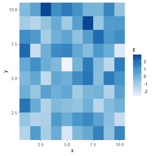
ggplot(data = data) +
    geom_tile(mapping = aes(x = x,
                            y = y,
                            fill = z))+
    scale_x_continuous(expand = c(0,0))+
    scale_y_continuous(expand = c(0,0))+
    scale_fill_distiller(palette = 'Blues', direction = 1)
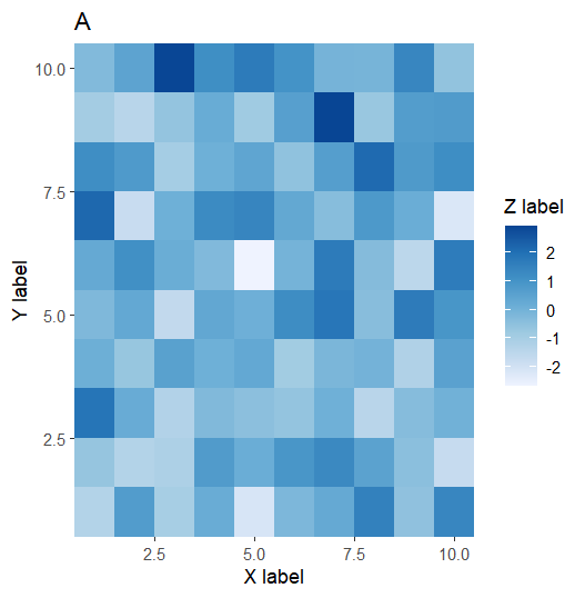
Labels and legends
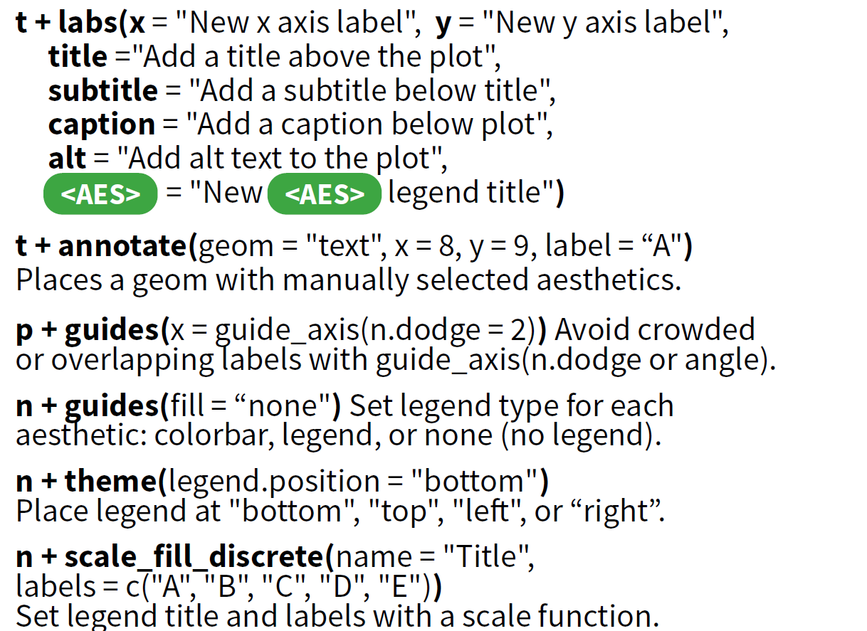
Labels
ggplot(data = data) +
    geom_tile(mapping = aes(x = x,
                            y = y,
                            fill = z))+
    scale_x_continuous(expand = c(0,0))+
    scale_y_continuous(expand = c(0,0))+
    scale_fill_distiller(palette = 'Blues', direction = 1)+
    labs(title = 'A',
         subtitle = NULL,
         x = 'X label',
         y = 'Y label',
         fill = 'Z label')
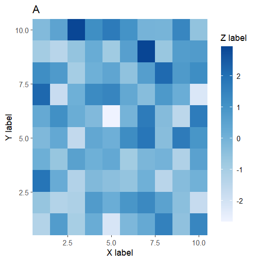
guides
ggplot(data = data) +
  geom_tile(mapping = aes(x = x, y = y, fill = z)) +
  scale_x_continuous(expand = c(0,0)) +
  scale_y_continuous(expand = c(0,0)) +
  scale_fill_distiller(palette = 'Blues', direction = 1) +
  labs(title = 'A',
       subtitle = NULL,
       x = 'X label',
       y = 'Y label',
       fill = 'Z label') +
  guides(fill = guide_colorbar(
      barwidth = 1,
      barheight = 15
  ))
Zooming
Save plot
# png
ggsave('plot.png', width = 10, height = 10, dpi = 300)
# pdf
ggsave('plot.pdf', width = 10, height = 10, device = cairo_pdf)
# pdf & 中文
ggsave('plot.pdf', width = 10, height = 10, device = cairo_pdf, family = 'GB1')
How to learn?
前人的工作+你的工作=最佳的统计图形
天才是极少数的,一个统计图形的设计需要经过大量的尝试,所以我们需要学习前人的工作。


